// STRATEGIC_IDENTITY_INDEX_01
// CASE_03: CREATION DUST EMPORIUM
Tactile Heritage: Engineering a Physical Brand Legacy

// PROJECT_CLASSIFICATION:
IDENTITY_RECONSTRUCTION // PRINT_PRODUCTION // COLLATERAL_SYSTEM // BRAND_STORYTELLING
From Concept to Consumer: Architecting a Brand Origin
Creation Dust began as a vision to bring the raw, tactile energy of grassroots Indian craftsmanship to a high-end, international marketplace. The challenge was Identity Architecture: building a visual foundation that honored its artisanal roots while commanding the authority of a premium global emporium.
We didn't just design a logo; we engineered a Brand Infrastructure. By architecting a visual language rooted in sunset gradients and balanced typography, we established a system where every physical touchpoint—from the first business card exchange to the final unboxing "Thank You"—acts as a deliberate chapter in the brand’s story.
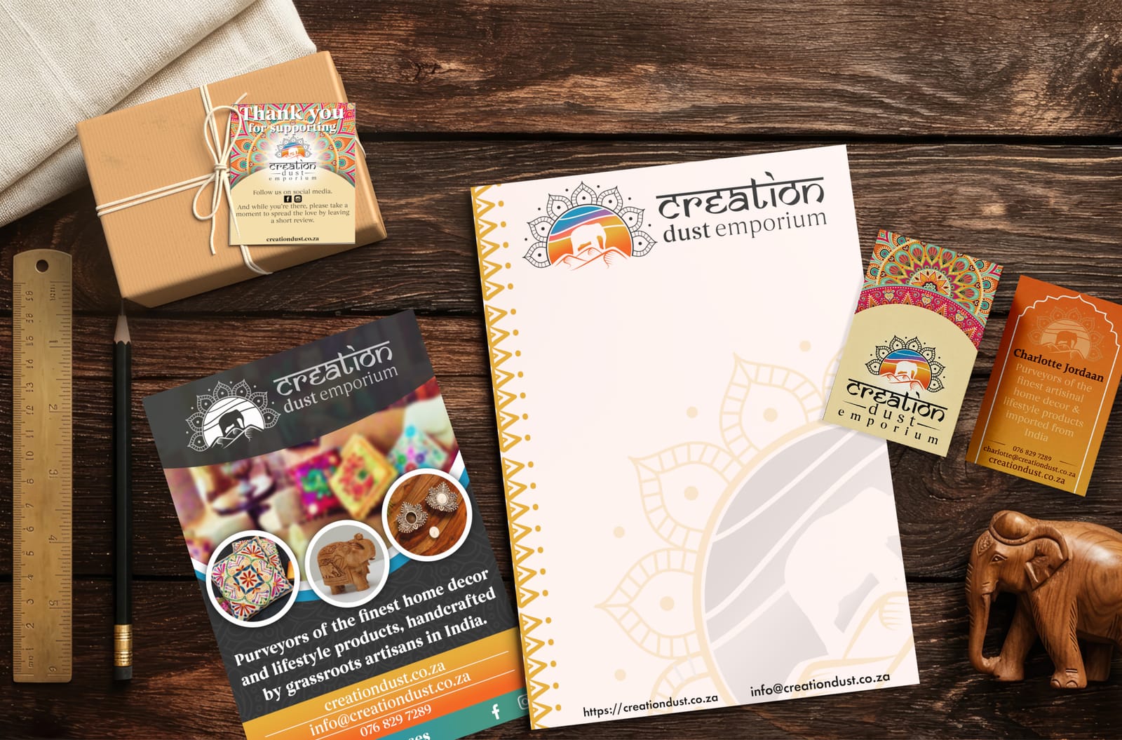
This case study documents the Foundational Build of the Creation Dust identity and its deployment across a comprehensive suite of premium print assets.
// what_we_did
- Brand Architecture: We engineered a complete visual identity from the ground up, establishing a professional and culturally resonant foundation for a new marketplace.
- Iconography Engineering: We designed a layered sunset emblem and custom silhouettes to serve as the core narrative engine for the brand’s storytelling.
- Typographic Strategy: We established a high-contrast dual-font system (Samarkan & Begum) to balance traditional artisanal rhythms with modern retail authority.
- Collateral Ecosystem: We architected and deployed a full suite of physical touchpoints—including business cards, letterheads, and product flyers—to ensure the brand was "retail-ready" from day one.
// LOGO_ARCHITECTURE: tHE_MARK_02
Architecting the Creation Dust Mark
The Challenge: An Identity Void
The Creation Dust emblem was engineered to serve as the brand's primary Narrative Engine. Built from a blank canvas, every geometric choice was made to communicate heritage, premium quality, and artisanal origin.
The LiveFuse Solution:
- Cultural Resonance: We engineered a visual anchor using a layered sunset gradient and a negative-space elephant silhouette. This ensured the brand felt "grounded" in its Indian heritage from the first glance, establishing an immediate emotional connection with the consumer.
- The Dual-Font Engine: We paired the rhythmic, Sanskrit-inspired serif font with and architectural serif. This created a strategic balance between artisanal storytelling and the professional authority required for a high-end, international marketplace.
- Chromatic Stratification: We developed a signature color system - transitioning from celestial blue to a warm red-orange. This "Sunset Logic" was designed to work across both light and dark backgrounds, maintaining the logo’s integrity regardless of the medium.
- Geometric Halo: We framed the core landscape with a mandala-inspired accent. This serves as a "Technical Border" that provides visual stability, allowing the intricate logo to remain balanced on minimalist surfaces like premium product packaging.
BUILD LOG: This mark is the foundational DNA for the entire business. By architecting a scalable visual system rather than just a standalone graphic, we created a "Genesis Mark" that is retail-ready and capable of carrying the brand’s premium soul across any physical or digital application.
// tactile_ARCHITECTURE: tHE_asset_03
Architecting the Networking Tool

The Challenge: Engineering the Handheld Handshake
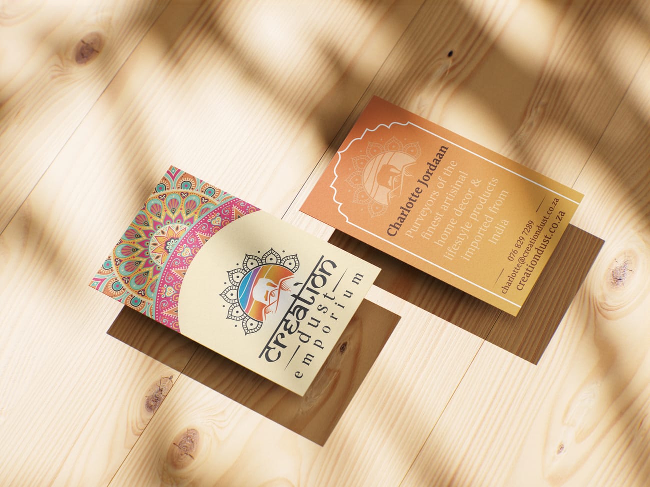
In a high end marketplace, the first physical exchange between a brand and a partner is critical. The challenge was to take the expansive visual DNA of Creation Dust and condense it into a high impact networking tool. We had to ensure that the intricacy of the mandala and the depth of the sunset gradients did not lose their professional authority when scaled down to a standard card size.
We focused on Spatial Architecture, utilizing the front of the card for pure brand immersion and the reverse for structural information. This ensures that the recipient experiences the artisanal soul of the business immediately, followed by the architectural clarity of the contact data.
The LiveFuse Solution:
Bifurcated Brand Logic: We separated the brand experience into two distinct layers. The card front serves as a high impact visual anchor using the full mandala pattern, while the reverse is dedicated to clean, functional data.
Gradient Depth Engineering: We applied the signature sunset palette as a structural background on the contact side. This ensures the physical card feels like a cohesive piece of the identity rather than just a printed name, maintaining the premium aesthetic on both surfaces.
Typographic Hierarchy: We utilized the architectural serif font for the name and contact details to ensure maximum legibility at small point sizes. This provides a professional contrast to the more decorative sanksrit serif brand mark found on the front.
Visual Stability Frames: We introduced a subtle archway border on the contact side to mirror traditional Indian architectural elements. This frame provides a geometric boundary that keeps the information centered and grounded within the limited physical space.
BUILD LOG: The business card is the brand’s most portable infrastructure. By treating the small surface area as a precision layout task, we created a networking tool that feels substantial and authoritative, successfully bridging the gap between artisanal heritage and professional retail.
// tactile_ARCHITECTURE: tHE_letterhead_04
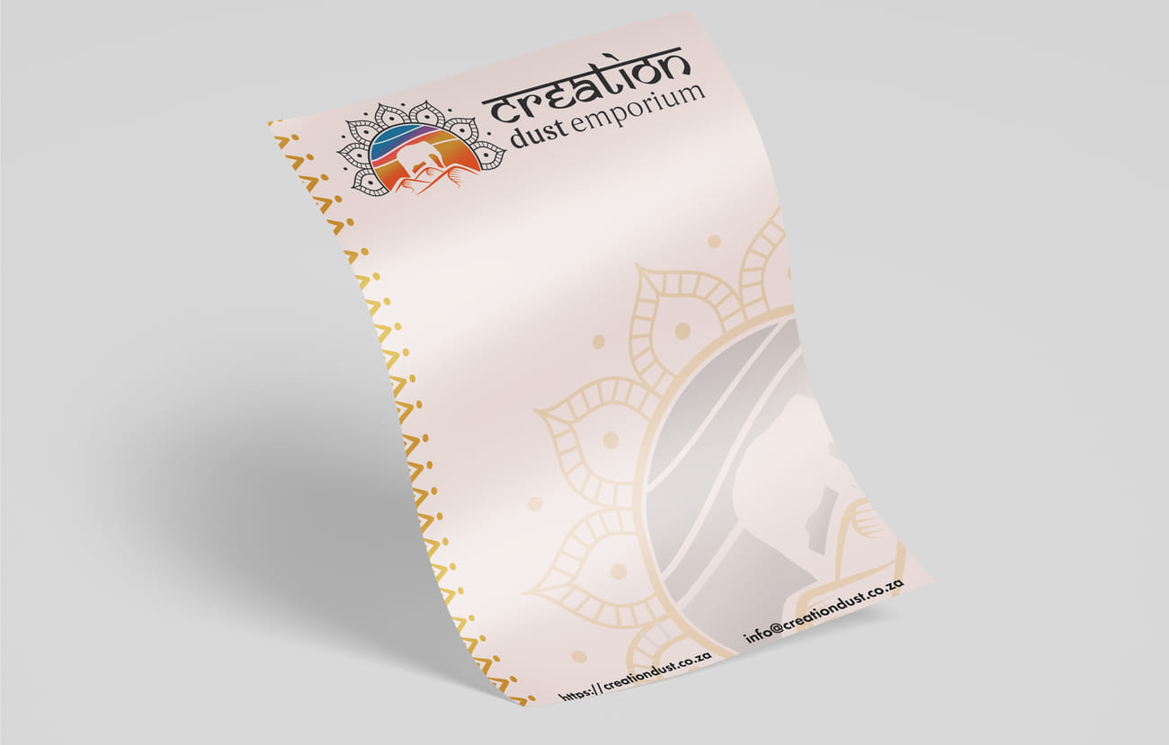
Architecting the Corporate Framework

The Challenge: An Unmapped Origin
An identity is only as strong as its most functional application. For Creation Dust, the transition from a decorative mark to a corporate asset required the engineering of a Document Framework. The goal was to ensure that every official correspondence carried the same weight and artisanal prestige as the product packaging itself.
By architecting specific margins, geometric boundaries, and a tiered typographic hierarchy, we transformed a blank sheet of paper into a Strategic Communication Tool. This layout ensures that while the brand's heritage is always present through subtle watermarking and borders, the focus remains on the professional clarity of the contents.
This section documents the deployment of the brand's visual DNA onto its primary medium for official business.
The LiveFuse Solution:
Geometric Framing: We engineered a custom vertical border that mimics the rhythm of the logo’s mandala accents. This provides a structural anchor for every document, ensuring the brand is instantly recognizable before a single word is read.
Watermark Logic: We utilized a large, low-opacity version of the central emblem as a background watermark. This adds a tactile, premium layer to the page without interfering with the legibility of professional correspondence.
Information Architecture: The footer and header were designed to host technical data like URLs and email addresses using Begum. This provides a clean, architectural finish that contrasts with the more decorative Samarkan brand mark.
BUILD LOG: The letterhead is more than a document template; it is a physical extension of the brand’s authority. By architecting specific margins and typographic hierarchies, we ensured that every piece of official mail carries the same artisanal soul as the products themselves.
// tactile_ARCHITECTURE: tHE_flyer_05
Architecting the Marketing Outreach

The Challenge: Engineering the Promotional Engine
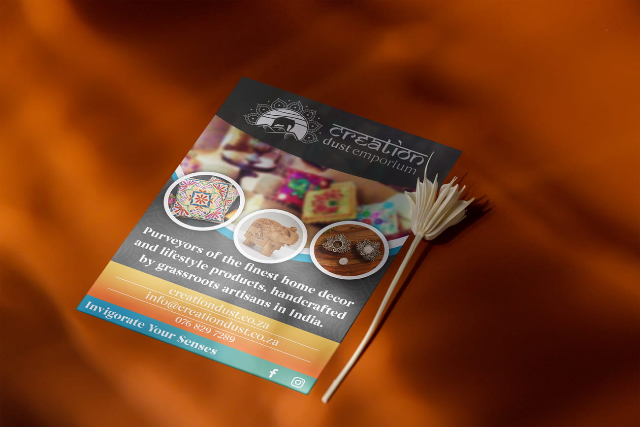
Marketing assets in a retail environment must do more than look professional; they must function as an immediate bridge between curiosity and conversion. The challenge was to transform the brand identity into a promotional layout that could capture attention in a high-traffic physical space. We had to ensure that the heritage-heavy aesthetics did not obscure the core commercial message.
We approached the flyer as a piece of Visual Cartography, mapping out a path for the eye to follow. By strategically placing the brand’s "Sunset Logic" and geometric accents, we created a hierarchy that guides the viewer from the emotional appeal of the imagery to the technical details of the offer.
This section documents the deployment of the brand DNA into a functional sales tool designed for external consumer engagement.
The LiveFuse Solution:
Radial Product Focus: We engineered three high-contrast circular modules to serve as the primary visual anchors. This framing technique isolates the handcrafted details of the products—the textiles, carvings, and candle holders—ensuring they stand out against the ambient background.
Depth of Field Logic: We utilized a blurred environmental background to provide context and warmth without competing with the product details. This creates a "Lifestyle Layer" that suggests the brand's place within a home, while the crisp foreground elements maintain commercial clarity.
Color-Blocked Infrastructure: We designed a tiered footer system using the brand's teal and gold palette. This architectural base provides a stable platform for the contact data and social icons, ensuring the "Invigorate Your Senses" call to action is the definitive closing statement.
Sub-Surface Branding: We integrated the mandala pattern as a subtle, low-opacity texture in the dark teal sections. This ensures the brand’s visual DNA is woven into the layout’s foundation rather than just sitting on top of it.
BUILD LOG: The product flyer is a study in focal balance. By using radial framing and strategic color blocking, we created a layout that guides the customer from brand recognition (header) to product desire (center) to actionable contact (footer).
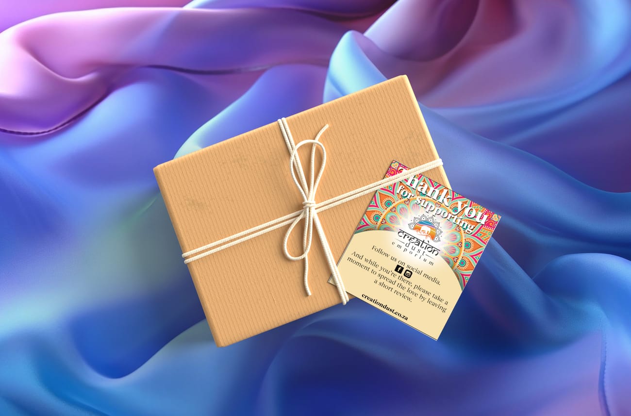
// tactile_ARCHITECTURE: tHE_gratitude_06
Architecting gratitude into every customer touchpoint

The Challenge: Engineering the Gratitude Loop
Post-purchase collateral within a premium retail environment must transcend mere courtesy; it must function as a deliberate catalyst for brand loyalty. The challenge was to architect a gratitude-focused asset that could pivot a customer from a physical unboxing experience to a sustained digital engagement. We had to ensure that the vibrant, high-energy mandala aesthetics served as a focal anchor rather than a visual distraction from the secondary conversion goals.
We approached the thank you card as a piece of Relational Engineering, designing a feedback loop that guides the eye from the emotional impact of the brand’s "Sunset Logic" to the technical utility of social media prompts and review triggers. By strategically balancing the complex heritage patterns with a clean, parchment-toned "logic zone," we created a hierarchy that validates the purchase while incentivizing future interaction.
This section documents the deployment of the brand DNA into a functional retention tool designed for internal customer lifecycle management.
The LiveFuse Solution:
- Dual-Zone Architecture: We engineered a split-level layout that separates the "Atmospheric Brand" from the "Actionable Logic." By isolating the high-energy mandala into the upper arc, we created a visual halo that anchors the customer’s emotional connection to the purchase before transitioning into the functional data below.
- Radiant Focal Logic: We utilized a centered, glowing light-burst behind the brand logo to serve as a "Digital Heartbeat." This lighting technique ensures that the Creation Dust identity remains the most illuminated element of the card, acting as the bridge between the complex background patterns and the clean text area.
- Engagement Infrastructure: We designed a parchment-toned "Logic Zone" at the base to provide a high-contrast platform for social conversion. This architectural choice ensures that the Instagram and Facebook triggers are immediately scannable, transforming a traditional thank you into a deliberate invitation for digital community entry.
- Integrated Motif-Layering: We embedded the secondary brand patterns as a subtle, sub-surface texture within the header’s curve. This ensures the brand’s visual DNA is structurally integrated into the card's geometry, maintaining a sophisticated "Bespoke" feel that honors the grassroots origins of the products.
BUILD LOG: The thank you card is a study in Relational Flow. By balancing high-impact artisanal patterns with a structured, low-distraction conversion zone, we created a post-purchase asset that moves the user from "Gratitude" (Header) to "Affinity" (Logo) to "Engagement" (Social Footer).
// PROJECT_IMPACT_SUMMARY_07
Identity Initialized // Market Entry Engineered
The Creation Dust Challenge:
As a new brand entering a competitive retail space, Creation Dust Emporium lacked a physical footprint. The challenge was to architect a high-spec visual language from the ground up—one that could translate an artisanal, grassroots ethos into a professional commercial framework. Without an existing asset library, the brand required a complete "Outreach-to-Retention" system that could command attention in premium environments immediately.
The LiveFuse Solution:
- Foundation Established: We engineered the brand’s first "Promotional Engine," a high-contrast flyer system that bridges the gap between raw artisanal craft and sophisticated retail standards.
- Immediate Conversion Flow: By deploying the "Gratitude Loop" strategy on day one, we ensured that the very first customers were systematically funneled toward digital engagement and review platforms.
- Scalable DNA: We architected a modular design language—utilizing "Radial Product Focus" and "Sunset Logic"—that the brand can now replicate across all future product categories.
- Professional Market Presence: Creation Dust launched with a cohesive, high-performance collateral suite that positions them as an established, premium player in the handcrafted lifestyle sector
// project_gallery
[ TAP_TO_EXPAND // VIEW_FULL_RESOLUTION ]